The Shut Down Comparison!
Studying the ways of shutting down the computer has been kind of a research area among operating system GUI designers. Although we as users do not see it, designing a simple interface like shutting down the computer takes lots of user studies and research. Today with number of operating systems that we use, we can see different approaches they have taken on how to present the user with the least annoying Shut Down interface.
Ill compare the shut down mechanisms of the 3 major operating systems we use; Windows XP, Windows Vista and Ubuntu 9.04. Specifically, Ill consider the number of mouse clicks and mouse movement they require from the user. Although there are shortcut keys associated with them, I wont consider them since ordinary users wont know about them anyway.
Windows XP
In XP, users have to go through 2 dialog boxes to accomplish the task. First, the start menu and the second, the final shut down box.
- Click Start button. (click 1)
- Click "Turn Off Computer". (click 2)
- Move the mouse to the center of the screen.
- Click "Turn Off" button. (click 3)
 It is clear that this involves 3 mouse clicks and a mouse movement across the screen. Although, as IT people the mouse is in our "genes", this is a fair amount of work load for a typical user. (You shouldve seen the time it takes for our grandma to do this)
Windows Vista
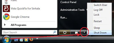
This is totally confusing for new users. There are number of ways you can shut down. With the default settings, you see a yellow "shut-down-like" button. People mistake this as the shut down button where it actually means "Sleep". To truly shut down the computer, you have to click the small arrow, and choose Shut Down from the not-so-simple menu that appears. This process needs a very high amount of concentration from the user.
This is the way you do it with default settings.
- Click Start button. (click 1)
- Click the small arrow to the right of Sleep and Lock buttons. (click 2)
- Choose "Shut Down" from the the list. (click 3) (This list has 6 items. If you needed to Restart you have to find where restart is in the list. Shut Down is easier since its the bottom-most item.)
 This process requires 3 clicks (same as XP). But it also requires the user to thoroughly concentrate on what he/she is doing, which is too much to ask from an ordinary user.
You can change the behavior of the Sleep button to Shut Down via power settings. Read this for instructions on how to change it. Then the whole process changes.
- Click start button. (click 1)
- Click "Shut Down" button. (click 2)
 Now its only 2 clicks. So simple. The catch is that the red Shut Down button is very easily reachable. User dont get any confirmation dialog box after clicking this. So when you click it, wooosh! its bye bye windows. So its prone to unintended shut downs.
In Vista they have increased the number of ways to shut down and none of them are perfect. XP way is better in my opinion.
Ubuntu 9.04
Ubuntu 9.04 reportedly have a nice and clean interface. This is true for their Shut Down mechanism too. Although they have borrowed the idea from Apple MacOS X, they does a good job integrating it with their user interface.
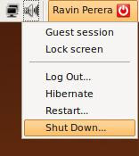
- Click the power button at the upper-right corner. (click 1)
- Choose Shut Down from the menu. (click 2) (Menu has 6 items. Shut Down is at the bottom and Restart is the one before that)
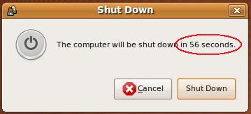
 Thats it. If you are lazy you can leave your computer and it will shut down. But if you made an error in your decision you can always cancel it since it displays this time-out dialog box.
 If you choose, you can continue the previous process further.
- Move the mouse to the Shut Down dialog box.
- Click the shut down button. (click 3)
Its "2 clicks" or "3 clicks with a mouse move" depending on the way you choose. But always the result is the same and you have the confirmation dialog so you can undo your decision. This is the nicest shut down process Ive seen so far (including MacOS X).
Finally, see how much we can talk about a simple operation like this. (as if we dont have anything else to do!) These subtle changes effect the users perception of an operating system. And most of the time, these are the "only" things that a user uses to judge an operating system.
Any thoughts?
.
.
download file now